Ian Ayres (Yale Law School) & Quinn Curtis (UVA School of Law)

Scores of lawsuits have pushed retirement plan sponsors to shorter, easier-to-navigate menus, but – as Ian Ayres and Quinn Curtis argue in this work – we’ve only scratched the surface of retirement plan design. Using participant-level plan data and straightforward tests, Ayres and Curtis show how plan sponsors can monitor plans for likely allocation mistakes and adapt menus to encourage success. Beginning with an overview of the problem of high costs and the first empirical evidence on retirement plan fee lawsuits, they offer an overview of the current plan landscape. They then show, based on reforms to a real plan, how streamlining menus, eliminating pitfalls, and adopting static and dynamic limits on participant allocations to certain risky assets or ‘guardrails’ can reduce mistakes and lead to better retirement outcomes. Focusing on plausible, easy-to-implement interventions, Retirement Guardrails shows that fiduciaries need not be limited to screening out funds but can design menus to actively promote good choices.
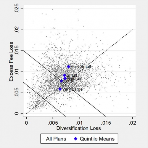
Each dot in the figure represents one of the approximately 3500 retirement plans (analyzed in our papers here and here). Together these plans invest about $120 billion. The vertical axis measures (in terms of risk-equivalent percent returns) the annual losses from plan investments charging higher fees than funds that are available in the market for even quite small plans (for example from Employee Fiduciary LLP or Vanguard’s small business 401(k) program). The horizontal axis measures (also in terms of risk-equivalent percent returns) the annual losses from plans failing to adequately diversify. The blue dots indicate the average results for different size plans.
From this single picture, one can see that:
- For most plans, excess fees are a larger problem than diversification loss—the scatter skews up and left of the 45-degree line;
- The vast majority of plans have combined fee and diversification losses of more 100 basis; points, and a majority (about 52%) of plans have combined annual losses of more than 150 basis points;
- Larger plans are lower cost, but even very large plans have average combined losses well in excess of 100 basis points; and,
- For smaller plans, a larger the percentage of the losses can be attributed to excess fees.